Who’s Ready for Algebra 1? Expanding Access and Equity in Atlanta Middle Schools

The most important thing to do with data is get it into the hands of the people who are actually doing the work.
Will Melton
Algebra 1 is often described as a “gateway” class, a pivotal moment that can shape the rest of a student’s K–12 education. Early access is key: successfully completing Algebra 1 in middle school allows students to complete advanced math and science coursework in high school, which research shows lead to higher wages and lower rates of unemployment in adulthood.
Yet early access to Algebra is far from certain, especially for students of color or from low-income families. Federal civil-rights data from 2020-21 shows that just 13 percent of Black 8th graders nationwide completed Algebra 1 compared to 25 percent of white 8th graders, and a 2023-24 survey by the RAND Corporation found the class was not even available in 24 percent of the country’s highest-poverty middle schools. These gaps mirror disparities in Advanced Placement courses in high school, STEM majors in college, and STEM careers after graduation.
The data is familiar to SDP Fellow alum Will Melton, Interim Director of Research and Evaluation at Atlanta Public schools (APS). Previously a high school math teacher in the district and surrounding suburbs, he saw disparities in advanced math enrollment firsthand.
“I actually taught Algebra 1 to the ninth graders in our district, and had seen how placement plays out in different sections of our math courses,” he said. “I always felt, in the back of my mind, that there were inequities associated with how students landed in those courses.”
As an SDP Fellow, Melton set out to build awareness and inform more equitable enrollment in middle-school Algebra classes. He analyzed enrollment trends, investigated the impact of placement criteria, and built a data dashboard to capture a richer picture of students’ readiness for advanced math study.
“My goal was to create a tool that can hopefully level the playing field and give schools the information they need to make better decisions for students,” he said.
Assessing Unequal Access
When Melton’s project began, just one in four APS middle schools offered Algebra 1 in person. The district was working in earnest to increase the number of middle-school educators certified to teach the course, which meant that school administrators would soon be placing greater numbers of students in Algebra 1. Who would they pick?
Melton began by establishing a baseline dataset of Algebra 1 enrollment by race. He looked only at the subset of students who had started middle school on grade level based on their 5th grade math scores and then traced their progression to either Algebra 1 or Math 8. Some 20 percent of White students and 22 percent of Asian students went on to pass Algebra 1 in 8th grade compared to 9 percent of Black students and 12 percent of Latinx students.
The takeaway was clear: Substantial shares of students whose state test scores would indicate Algebra readiness were not being enrolled in the class, with low-income students of color disproportionately relegated to Math 8. Melton turned his attention to the mechanisms at play.
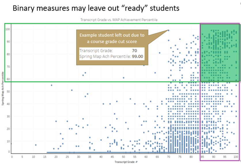
Earlier conversations with administrators from the Curriculum and Instruction Department had revealed the selection criteria for 8th grade Algebra 1: in 7th grade, students needed to have both an 85 or higher grade in math and score proficient or above on interim MAP Math assessments. However, research shows that considering a wider set of variables can expand access to accelerated math coursework, and a close look at APS student-level data found substantial numbers of students who did not strictly meet that criteria but could also be ready for Algebra 1.
Advancing equity in APS, then, would mean revisiting math placement practices. Course placements in Atlanta middle schools are set by school administrators, so the second phase of Melton’s project focused on providing them with a richer set of student-level data in the form of a usable tool.
Lessons in Dashboard Design
APS has a strong culture of data use and publishes extensive dashboards and search tools for stakeholders at all levels, from central office and building administrators to individual teachers and parents. In fact, Melton had used a Tableau dashboard as a classroom teacher, and was inspired to transition to data analysis by a district data fellowship summer program for teachers he completed in 2017.
Even so, the first version of a new math placement data dashboard flopped. It used a variety of data to calculate a weighted average qualifying score for every student based on individual grades, test scores, and growth based on interim assessments. These were mapped to school, state, and national averages to yield a final score, which administrators rejected as too difficult to understand and explain to parents.
Melton started over, with a new strategy: co-create alongside end-users. He convened administrators from three middle schools with varying experience in offering Algebra 1 and in regular meetings, presented and refined drafts of the tool based on their guidance and feedback. Based on those conversations, the new tool featured the same detailed student-level data, but was searchable, sortable, and had filters, while also clearly students’ subgroup status and school-level enrollment shares by race and economic status. This streamlined approach abandoned the mysterious summative score and eliminated the need for state and national comparisons, while providing an inclusive, richer data set and holding focus on race- and income-based disparities.
Then came the road show.
“Assistant principals tend to be the schedulers, so I went to an assistant principal meeting and got to present it to everyone in the room,” Melton said. “After that, everyone knew about it. The idea was, ‘here’s something you can use right now, even when you’re in the middle of scheduling.’”
The dashboard is up and running and data is refreshed every night. Conversations with school administrators continue and have already led to further refinements. For example, middle schools now have access to data for rising 6th graders before the end of their 5th grade year, which provides more time to evaluate and plan for a math sequence that culminates in students taking and passing Algebra 1 in 8th grade. Within the first few months, 11 of the district’s 15 middle schools had viewed the tool.
Lessons Learned
The eventual successful publication of the dashboard came down to two major factors: involve end-users throughout the planning process and keep the final product as simple as possible. Simple doesn’t mean inflexible, however; ongoing conversations with end-users have inspired further adjustments, including adding new subgroup filters and an easy csv file download option.
The day-to-day utility of the tool is what inspires its design and functionality and what, in the end, will advance better and more equitable math enrollment in APS, Melton said.
It comes down to balancing the idea of data in the abstract with the human beings at the other end of the spreadsheet—a familiar reverse journey to the teacher-turned-analyst.
“As a math teacher, I’d always geeked out about all of the different ways I could look at data in my own classroom, whether that was digging into SAT or AP scores,” he said. “I did not even realize the types of positions that existed like I have now. It’s incredibly rewarding. We don’t want to turn students into numbers, but when we look at numbers, we can find ways to help more students succeed.”